Dolby Labs: Audio Calibration & Hearing Wellness
Designing a 5-minute Mobile Hearing Test Without Sacrificing User Trust
COMPANY
ROLE
TIMELINE
Dolby Laboratories
Product Designer • Team of 8
August - December 2025 (16 weeks)
Problem
Hearing checks are clinically accurate but long, unintuitive, and frequently abandoned (especially in mobile contexts). How might we design an engaging & accessible hearing check that assists in audio calibration while promoting better hearing health?
Constraint
The experience needed to be completed in under five minutes to reduce abandonment while maintaining calibration credibility.
Outcome
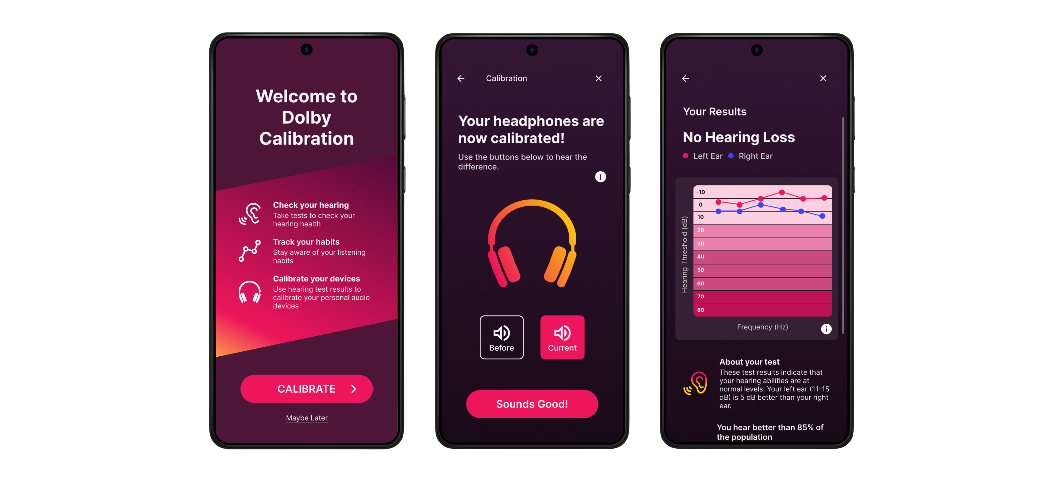
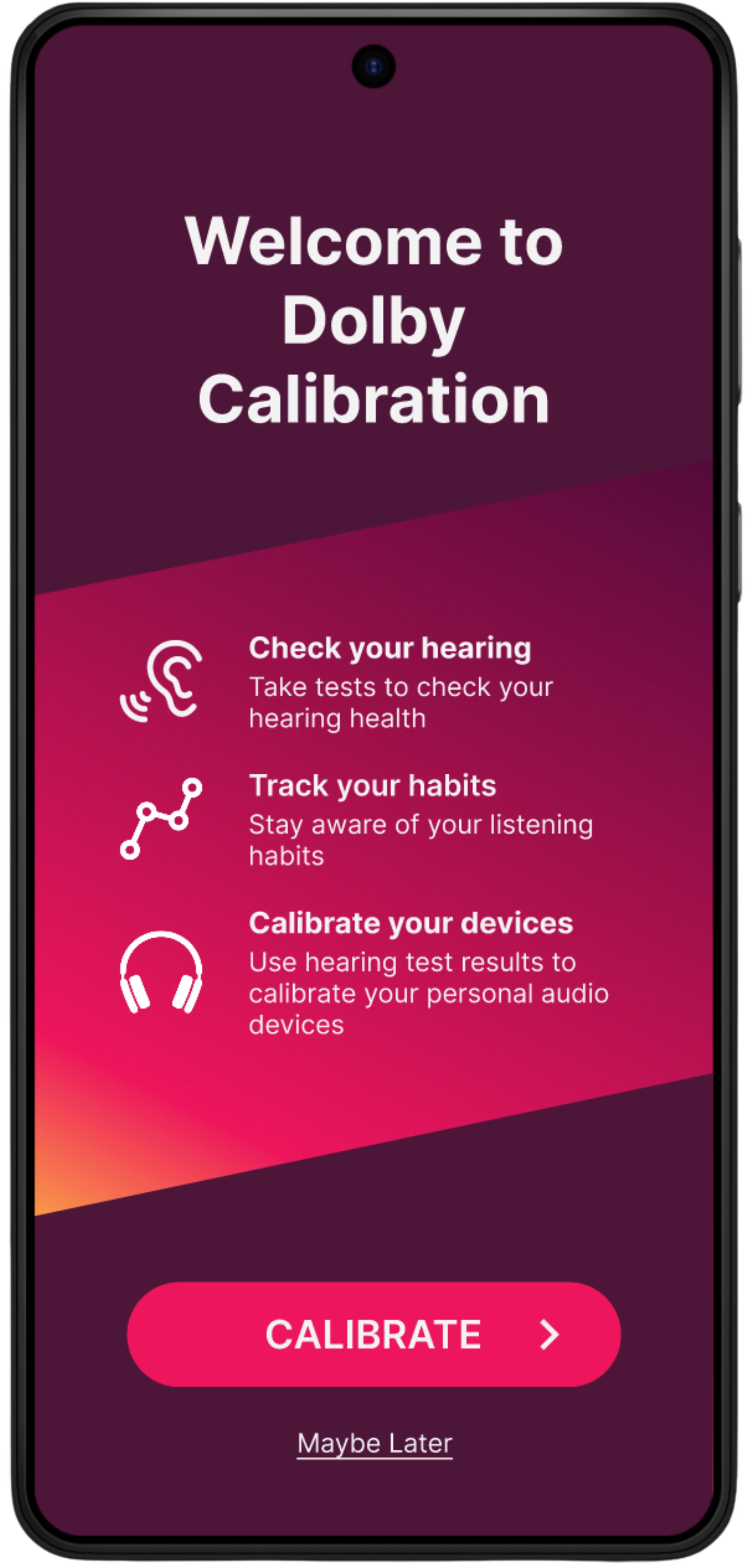
We designed a mobile hearing check that combines progressive feedback, proactive interactions, and guided pacing to help users complete the test confidently while supporting audio calibration and long-term hearing awareness.
PROJECT OVERVIEW
Although hearing loss affects millions worldwide, traditional audiometric/hearing tests can feel lengthy, clinical, and intimidating, leading many users to avoid or abandon them. With accurate audio calibration, everyday devices can provide easy, reliable hearing checks; helping users detect issues early and track their hearing health. What motivated me about this project was the tension between accuracy and engagement. A hearing test can be technically correct, but if users don’t complete it or trust the results, it fails in practice.
RESEARCH
How might we understand the current state of hearing checks and find potential technologies to implement in our final designs?
Before we could start ideating, we focused our research on reducing uncertainty around user behavior:
Where do users lose confidence during hearing checks?
How much explanation is enough before users feel overwhelmed?
What causes abandonment in the first 60-90 seconds of testing?
To answer these questions, I helped plan and conduct a mix of literature review, competitive analysis, user interviews, and a subject-matter expert interview with a clinical audiologist.
Key Research Insights
INSIGHT 01
Across interviews and secondary research, uncertainty was the main cause of abandonment. Users need clear test instructions and clear test results and often quit once the effort feels greater than the value.
Implication: We needed to design guidance and pacing that maintained confidence throughout the experience.
INSIGHT 02
Research showed that users rarely seek hearing checks unless they already suspect hearing loss. Preventative wellness framing alone did not strongly motivate participation or repeat use.
Implication: The product needed a clearer, more immediate value proposition to encourage completion.

At the conclusion of our research, we realized that preventative wellness alone was not enough to drive engagement to complete the test and we encountered our key pivot in which we decided to reframed the app's purpose from only being a health-oriented hearing check.
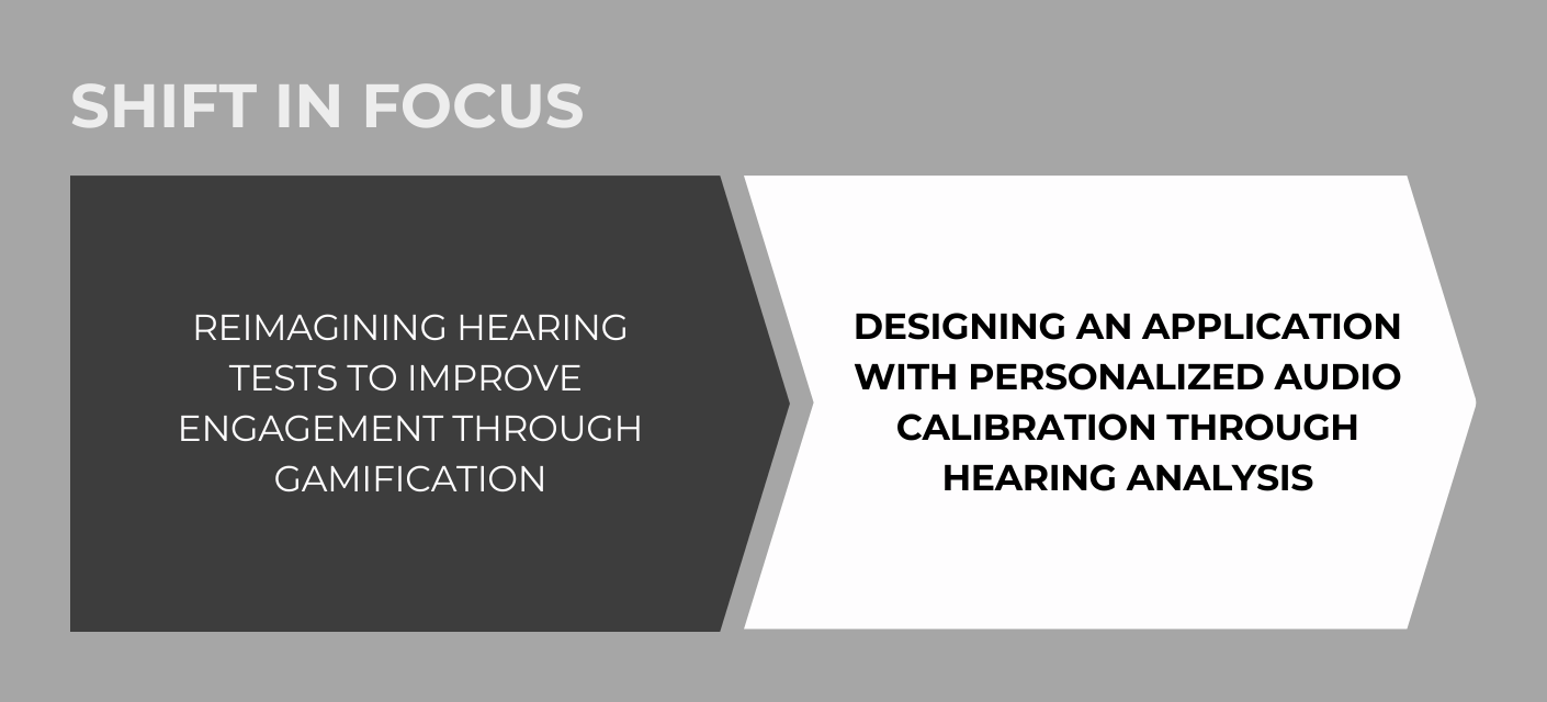
Our decision was to reframe the product as a personalized calibration-first experience, positioning hearing wellness as a secondary benefit. Calibration provided immediate, tangible value — giving users a concrete reason to complete the test while still supporting long-term hearing health. This pivot clarified priorities for interaction design, pacing, and results presentation. This not only addresses a root cause of hearing loss (improper listening device usage) but also increases user adoption.
IDEATION & PROTOTYPING
How might we create easy-to-navigate designs to minimize abandonment and encourage adoption?
With our research in place, we moved on to ideation. I contributed sketches exploring onboarding, testing interactions, and result interpretation, focusing on how users would move through the experience rather than isolated screens.
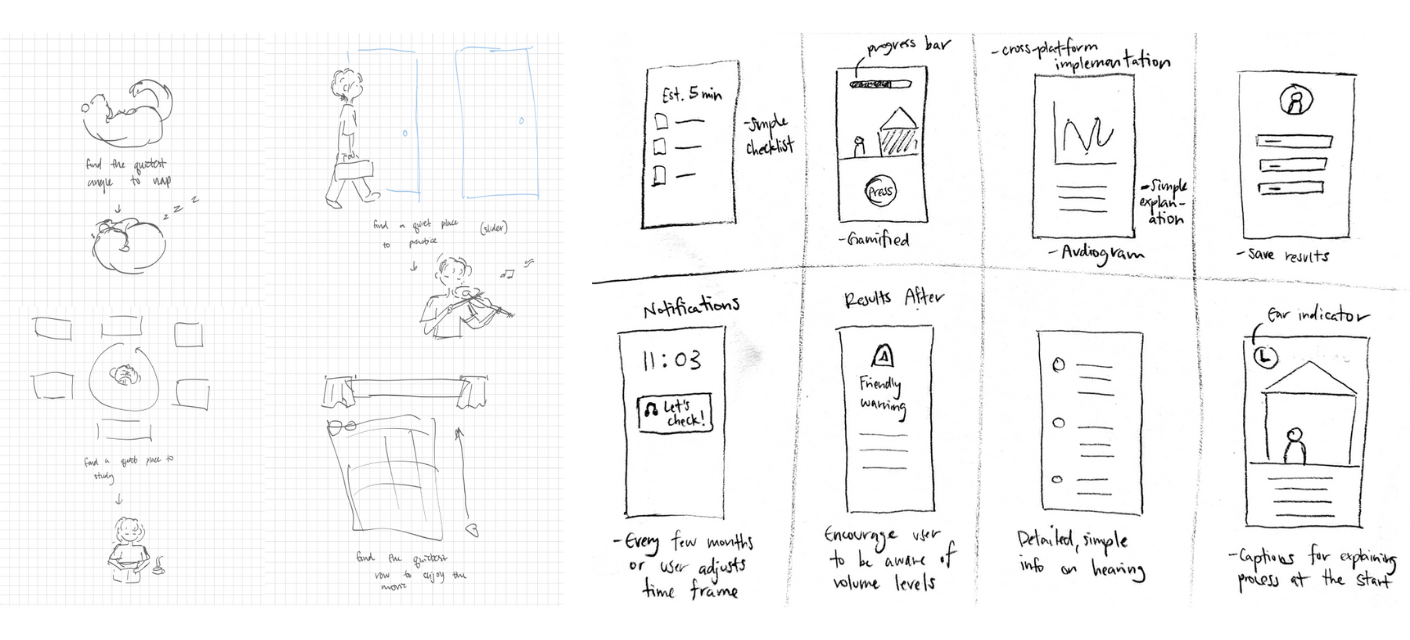
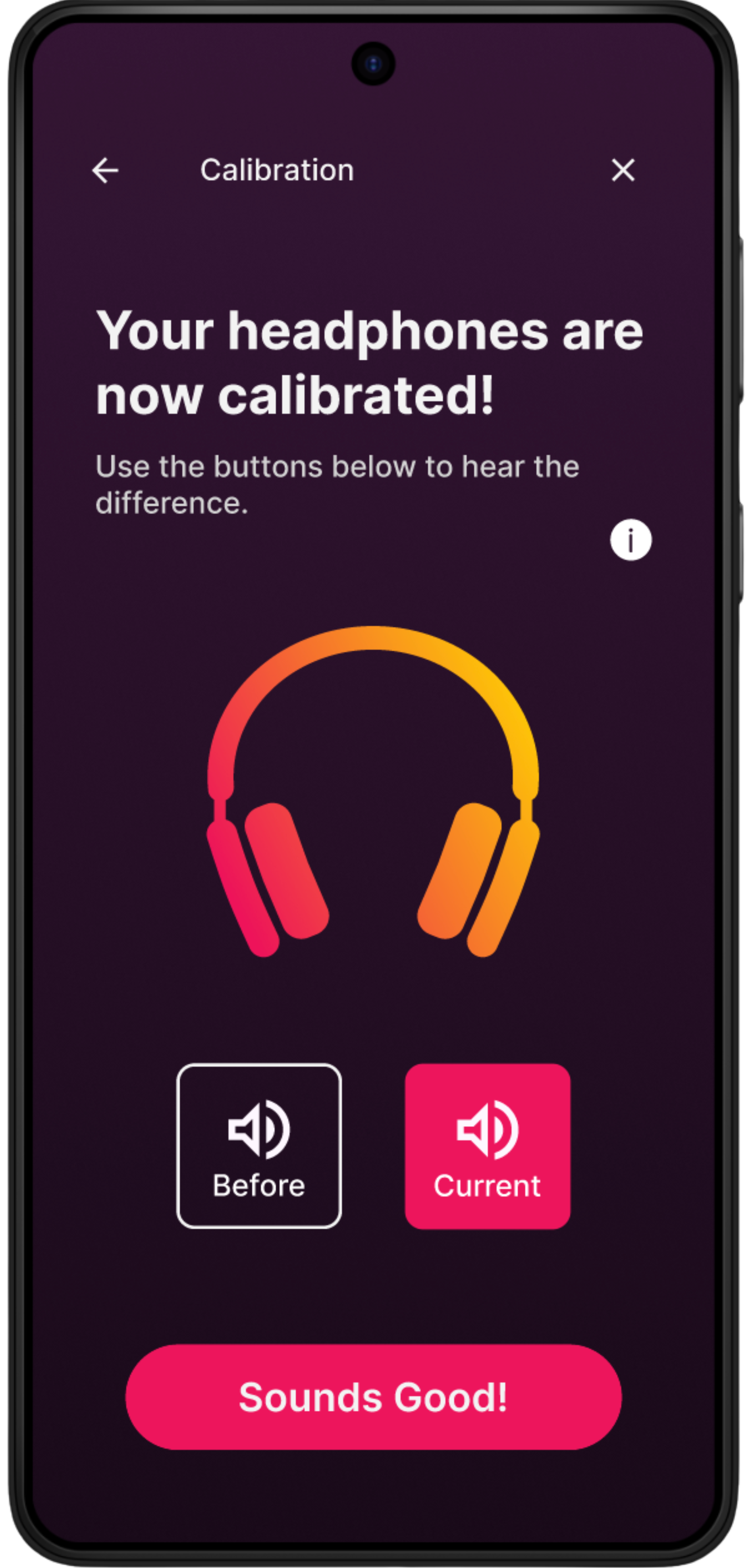
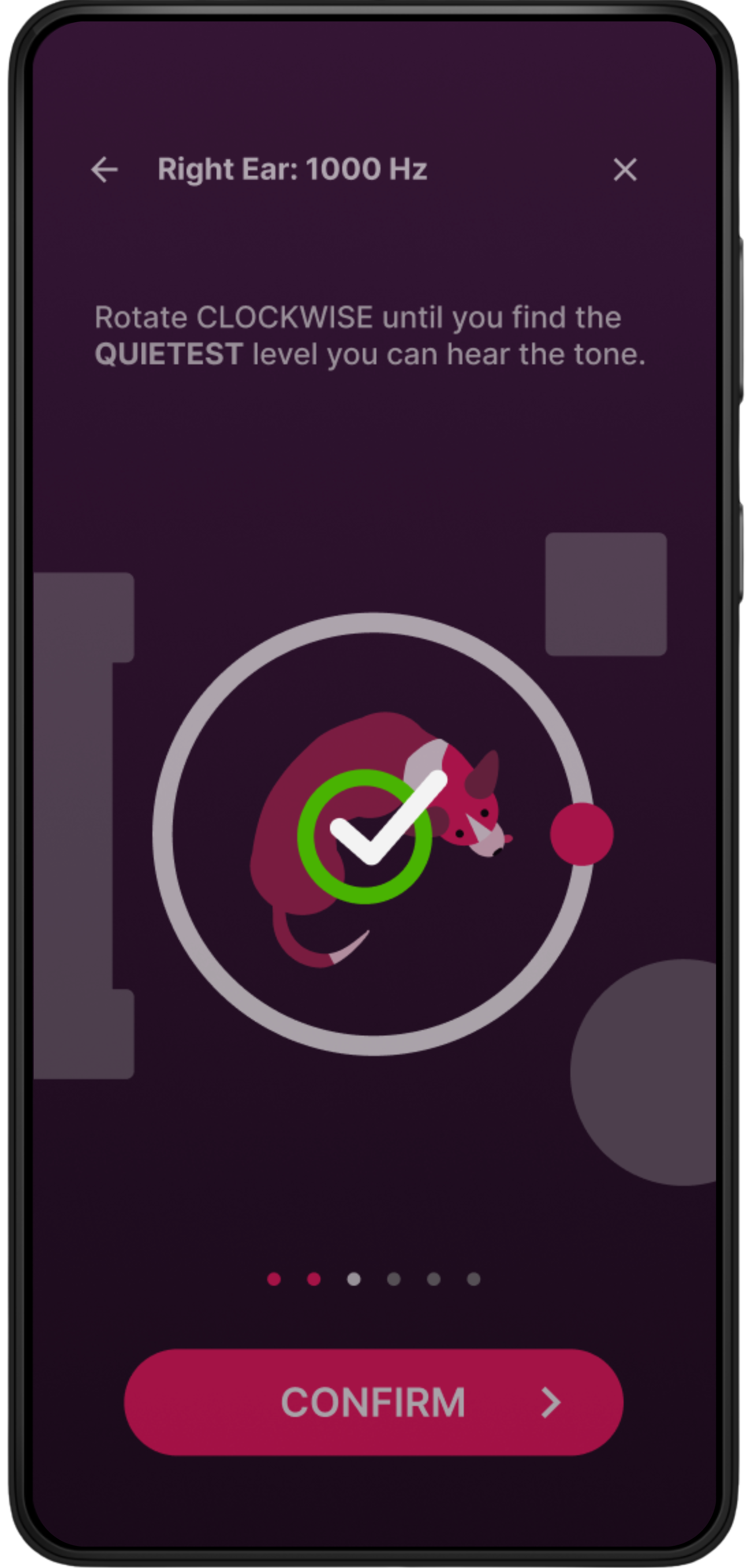
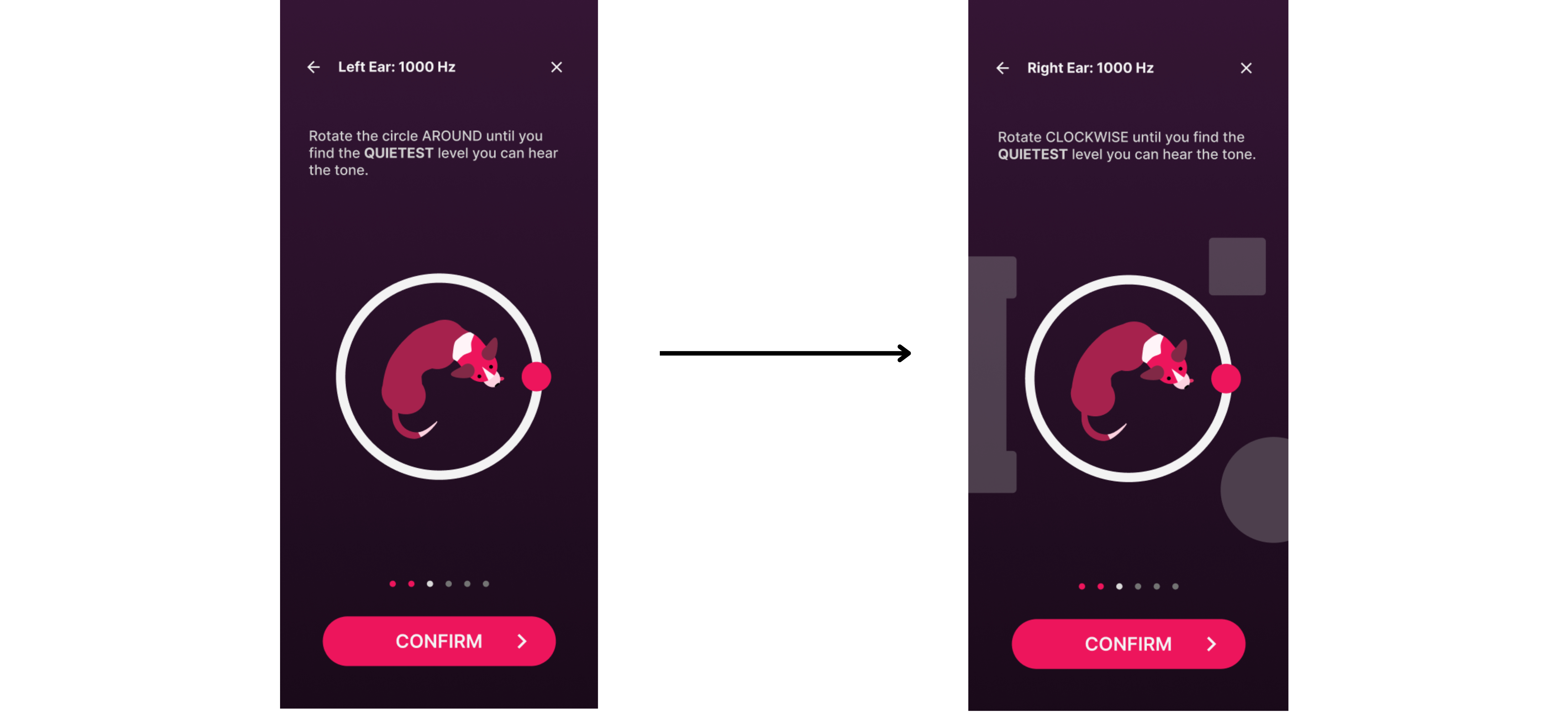
We then created low-fidelity wireframes covering: welcome, pre-test setup, the hearing test itself, results, history, and profile. For the test, we explored two visual directions.
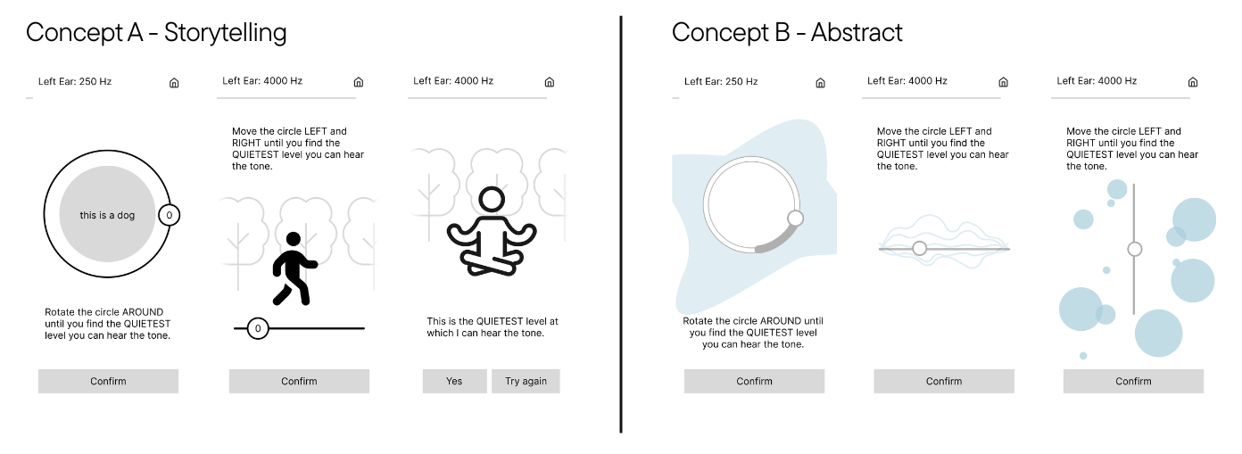
We also needed to validate which interaction type best balanced speed, enjoyment, and accuracy. Using an interactive web prototype, we tested three methods.
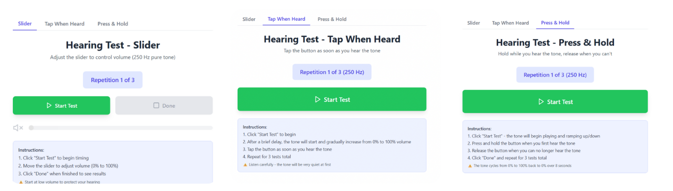
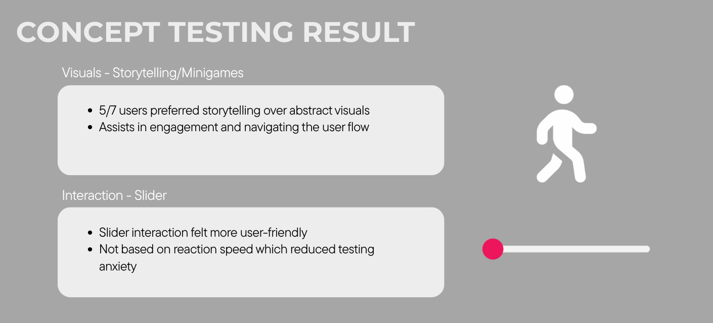
Concept testing showed that story-based flows were more engaging and motivating than abstract visuals, though users still wanted clearer onboarding, progress, and results. Slider interactions, while slightly slower on first use, became faster with familiarity and avoided reaction-time issues that inflated thresholds; participants also felt more in control with them than with tap-based methods which lowered testing anxiety. Based on this, we chose a slider interaction paired with story-based visuals as our core test pattern.
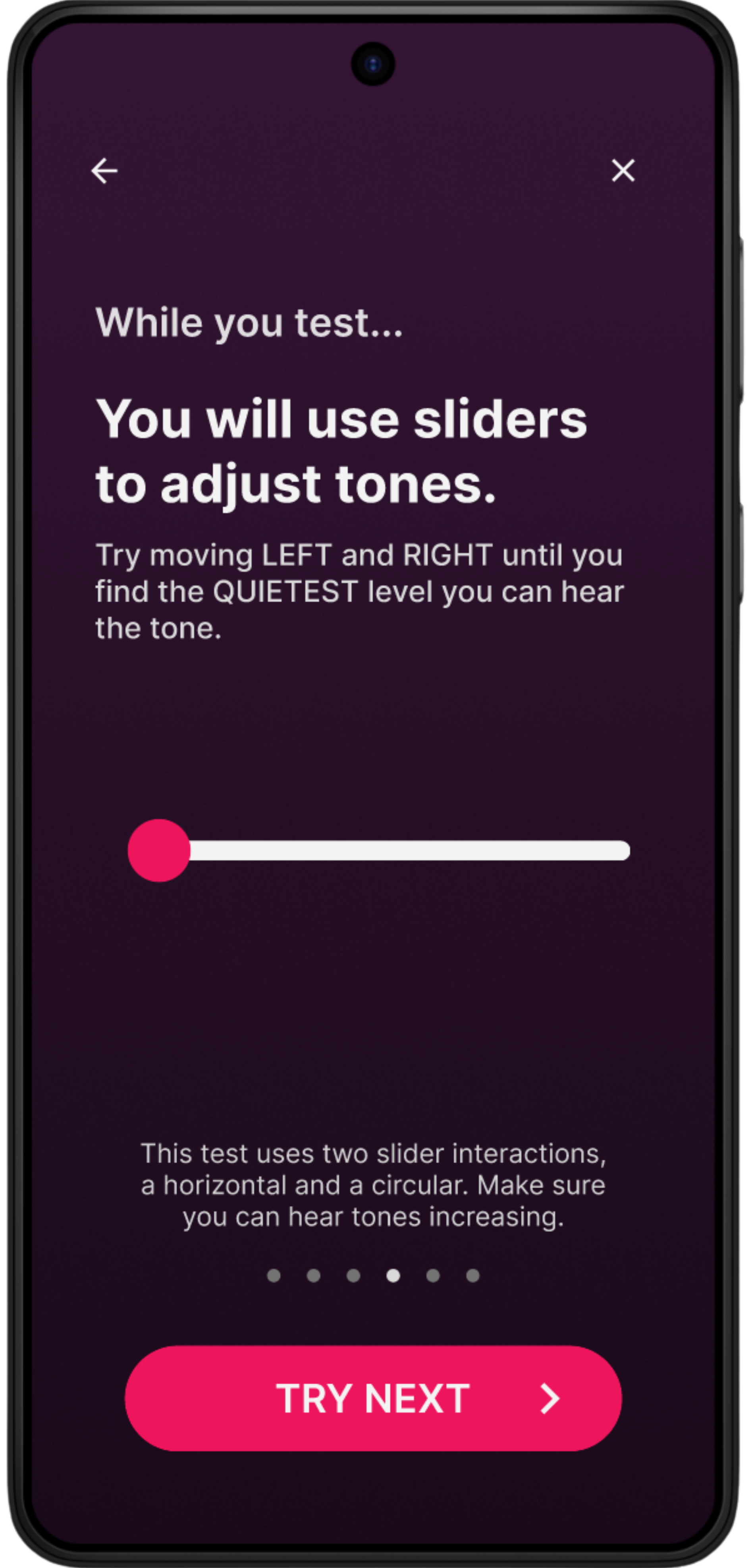
From there, we began to iterate our low-fidelity wireframes into mid and high-fidelity prototypes.
INSIGHT #1 – REFRAMED AS CALIBRATION-FIRST
Calibration aligned more closely with user motivation than wellness framing alone.
Impact: Design decisions prioritized trust, accuracy, and completion.
INSIGHT #2 – SLIDER INTERACTIONS OVER REACTIVE METHODS
Sliders allowed users to adjust and confirm responses, reducing frustration and reaction-time bias.
Impact: Users felt more in control and confident during the test.
INSIGHT #3 – PROGRESSIVE FEEDBACK OVER DENSE METRICS
Early exposure to technical data confused users and reduced trust.
Impact: Step-by-step feedback and confirmation states helped users stay oriented.
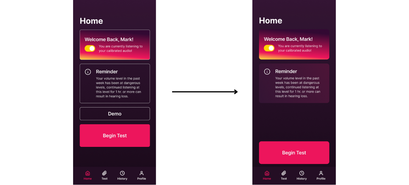
INSIGHT #4 – CONSTRAINED END-TO-END FLOW TO SUB 5 MINUTES
Abandonment increased when users were unsure how much effort remained.
Impact: Progress indicators, pre-test demos, and simplified offboarding improved completion confidence.
USABILITY TESTING & ITERATION
How might we test and iterate our designs to validate our process and show metric-based results?
Due to timeline limitations, we completed one formal round of usability testing. Rather than broad iteration, I prioritized validating the highest-risk interactions: calibration comprehension, result interpretation, and completion flow.
What we tested:
Completing the hearing test
Saving and interpreting results
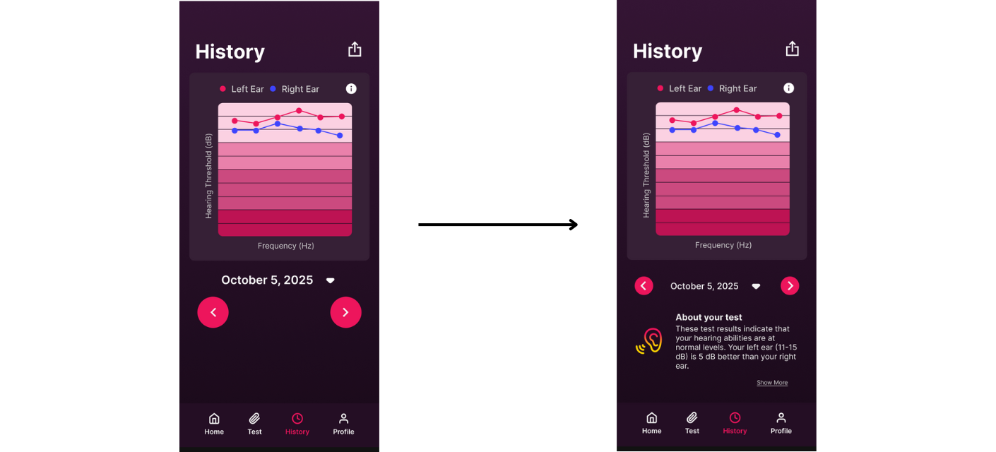
Navigating calibration history
Key Findings
Users completed interaction tasks in ~2:44 minutes (excluding audio-dependent actions)
Confusion centered around terminology, saving results, and history interpretation
"What does the 'Demo' button do?
...I'd rather have the demo at the start of each test and have the option to skip"
"I wasn't sure if the [navigation] buttons were related, maybe the date should be in between them."
"...To be honest, if you asked me what this meant later, I would not remember..."
"Is there supposed to be a background here or is it different on purpose?"
OUTCOMES
🎧
Designed a hearing check experience projected to complete within five minutes
🔍
Improved clarity and confidence through proactive interactions and guided pacing
👂
Balanced clinical credibility with approachability and personalization
FINAL PROJECT REFLECTION
This project reinforced that accuracy alone doesn’t build trust. Clarity, pacing, and reassurance are critical when designing health-related experiences. Designing for confidence required making tradeoffs explicit, prioritizing user understanding, and reframing the product around real user motivation.
If given more time, I would focus on validating long-term trust and repeat usage to better understand how calibration experiences shape ongoing engagement.
DIVE DEEPER
For this project's final deliverables, our team compiled the following products.
.png)